Heyday’s $6.5M Seed Pitch Deck
The recent venture market downturn has made it increasingly difficult for startups to raise money from investors. We are in the fortunate position of having been able to raise a seed round from top investors.
We’re sharing the pitch deck we used to raise our $6.5M Seed from Spark Capital, Abstract Ventures, Ride Ventures, Correlation Ventures, Space Cadet Ventures, and the Not Boring syndicate for fellow early-stage founders to use as a template when you raise a seed round of your own.
The goal of your seed pitch deck is to get investors excited enough to take a meeting with you. It also must include enough context that the initial meeting can be spent diving into exciting parts of the business - not clarifying the basics.
1: Title Slide
Investors see dozens of decks every day.
Grab their attention immediately with your title slide. We leaned into bright, expressive gestures in our design system to stand out.

2: Team Slide
Seed stage companies haven’t figured out many things. There will be many ups and downs. Use your team slide to communicate that even when things get hard, your team will stick together.
Our founders have worked together for more than seven years across multiple companies. Their relationship won’t implode when things get hard.

3: Problem Slide
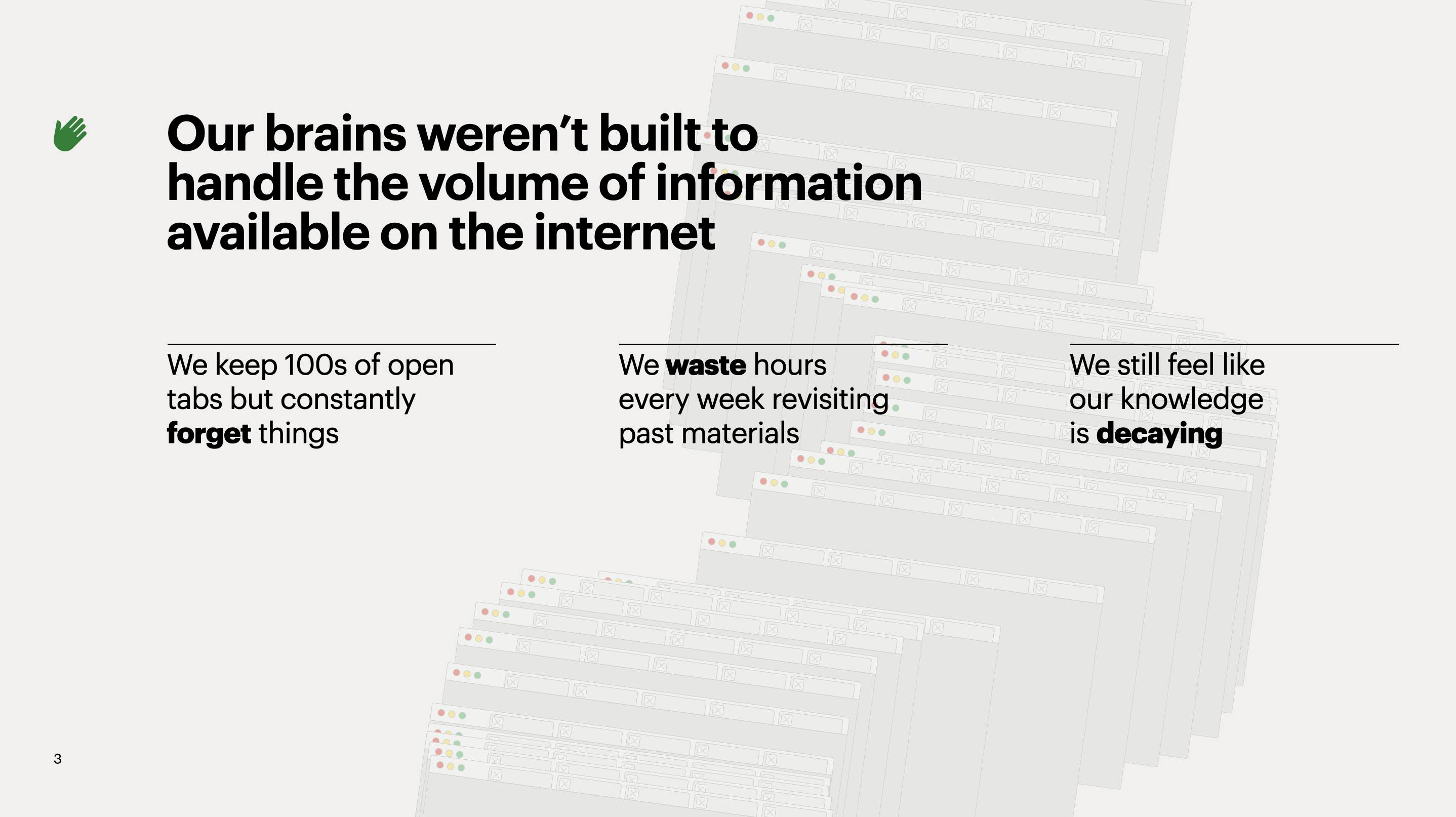
Having a bazillion open browser tabs is a symptom of the problem Heyday addresses.
An effective problem slide communicates the problem clearly, and ideally in a way that the audience feels personally. Investors who got most excited about Heyday experienced the tabs problem personally, and “just got it” as soon as they saw this slide:
4: Current Solutions Slide
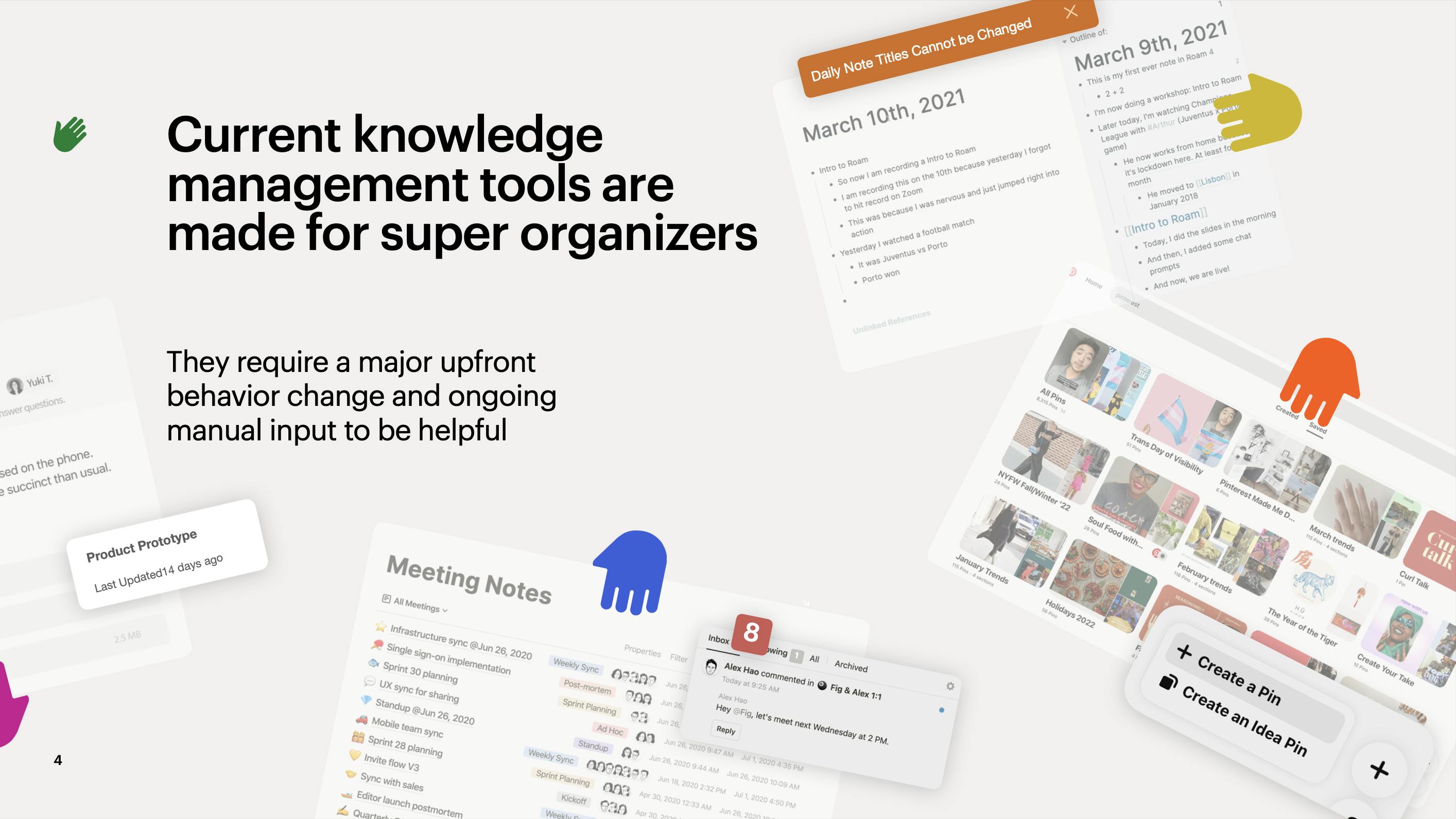
Well-known knowledge management tools address this problem, but they optimize for a different target user and require constant input:
5: Our Solution Slide
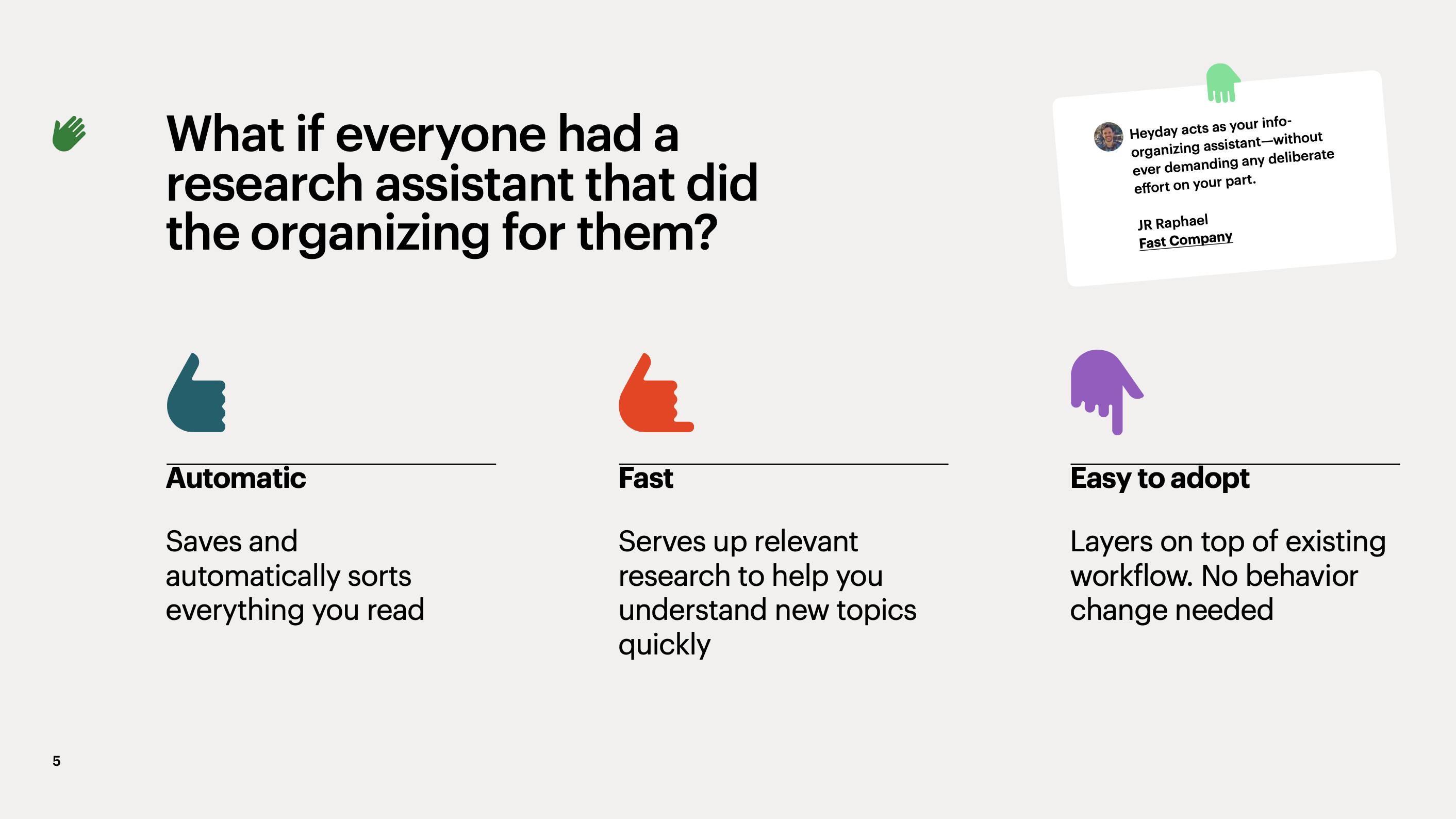
Heyday does things differently than other knowledge management tools:
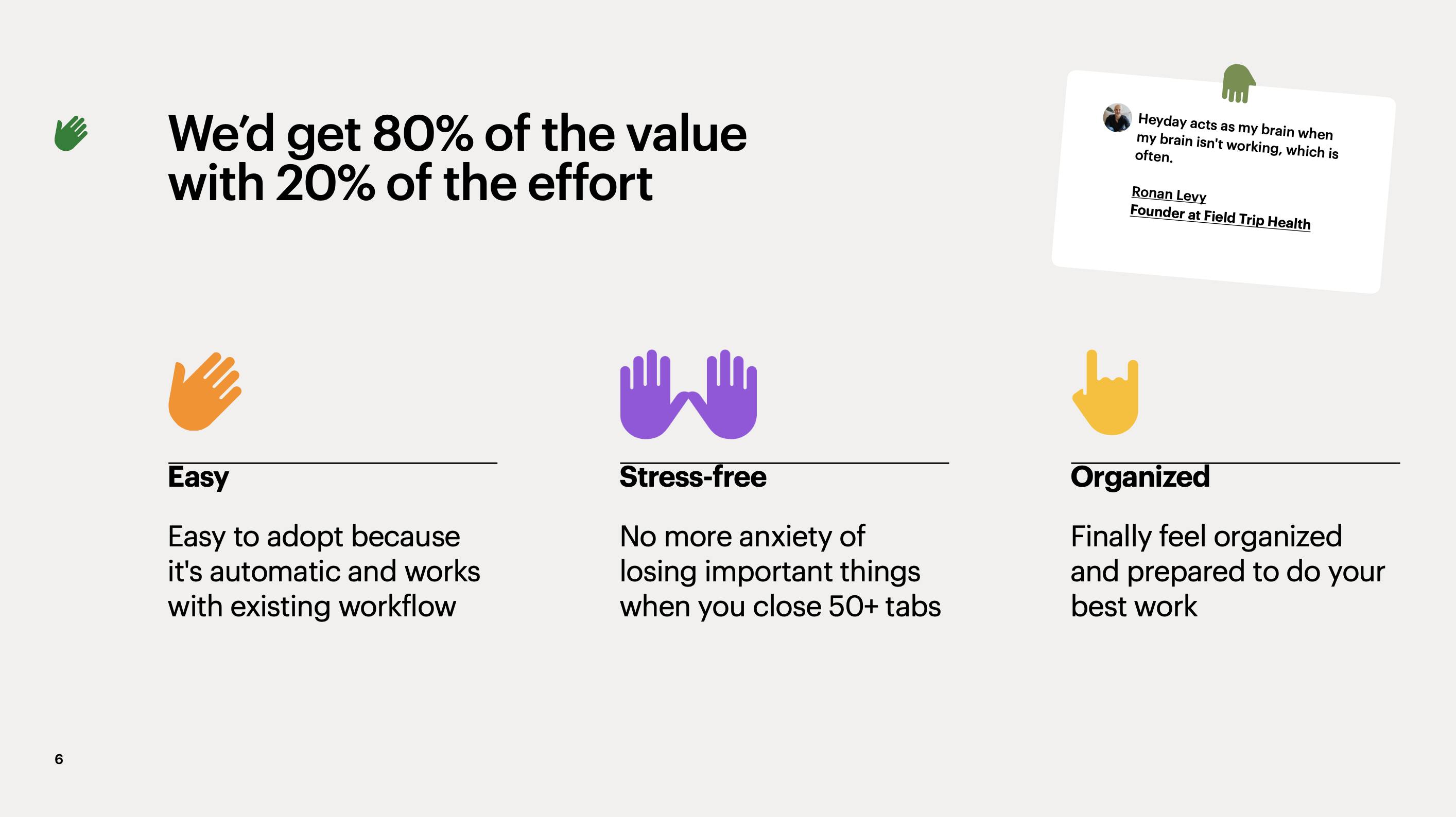
6: Product Benefit Slide
Heyday makes you smarter with minimal extra effort:
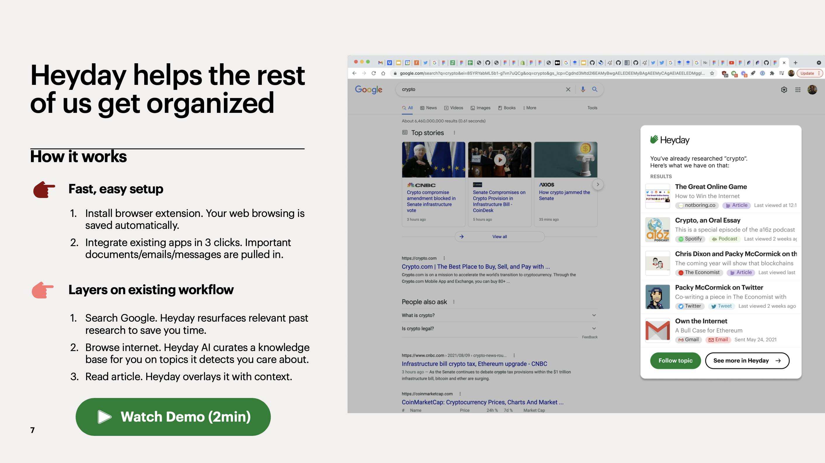
7: How it Works Slide
YC’s Kevin Hale makes says that a well-designed pitch deck should include a slide that explains your product in a way that is simple, obvious, and legible. He also says to not use screenshots.
We used a series of steps to explain how it works, then bucked the trend and included a screenshot. We think it’s okay to include a screenshot when the deck is primarily shared via email. We wouldn’t have used the screenshot if we were presenting on stage.
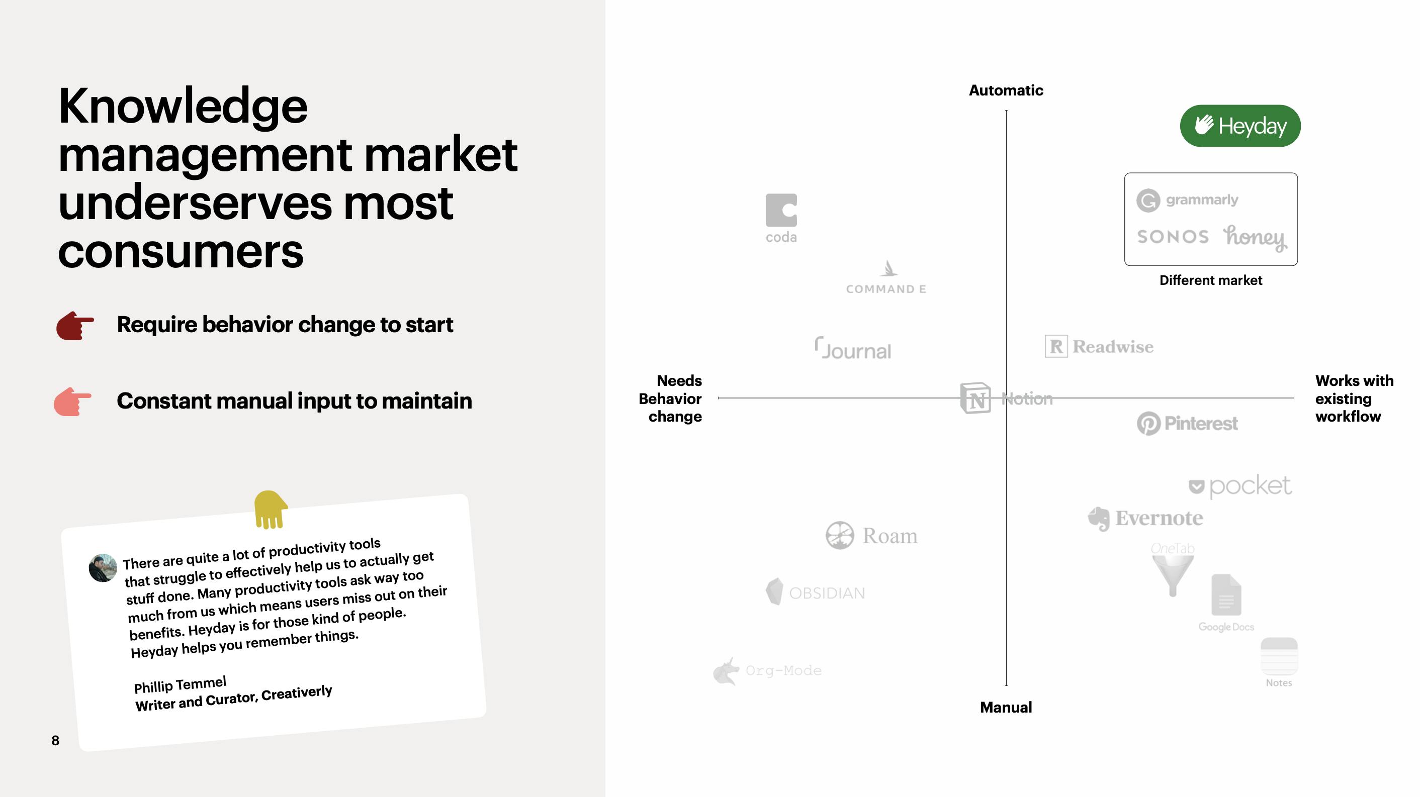
8: Competition Slide
No pitch deck is complete unless there is a competition slide that features a matrix with your company in the top right quadrant 😉.
The axes of the chart should support aspects of your product that differentiate you most from your competition. For us, it’s the ease of adoption and use.
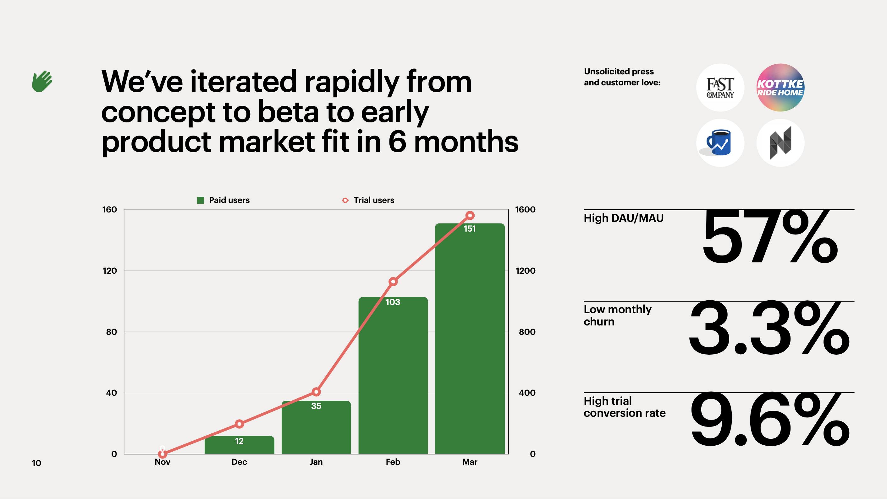
9: Traction Slide
Investors want to know about your traction and progress to date. We used our traction slide to show that people who try the product use it regularly and convert to paying customers at a healthy rate.
10: Future Plans Slide
Show that there’s a large potential upside if someone invests in your company.
We show here that we can become a massive company if we grow our single-player product into a multiplayer one.
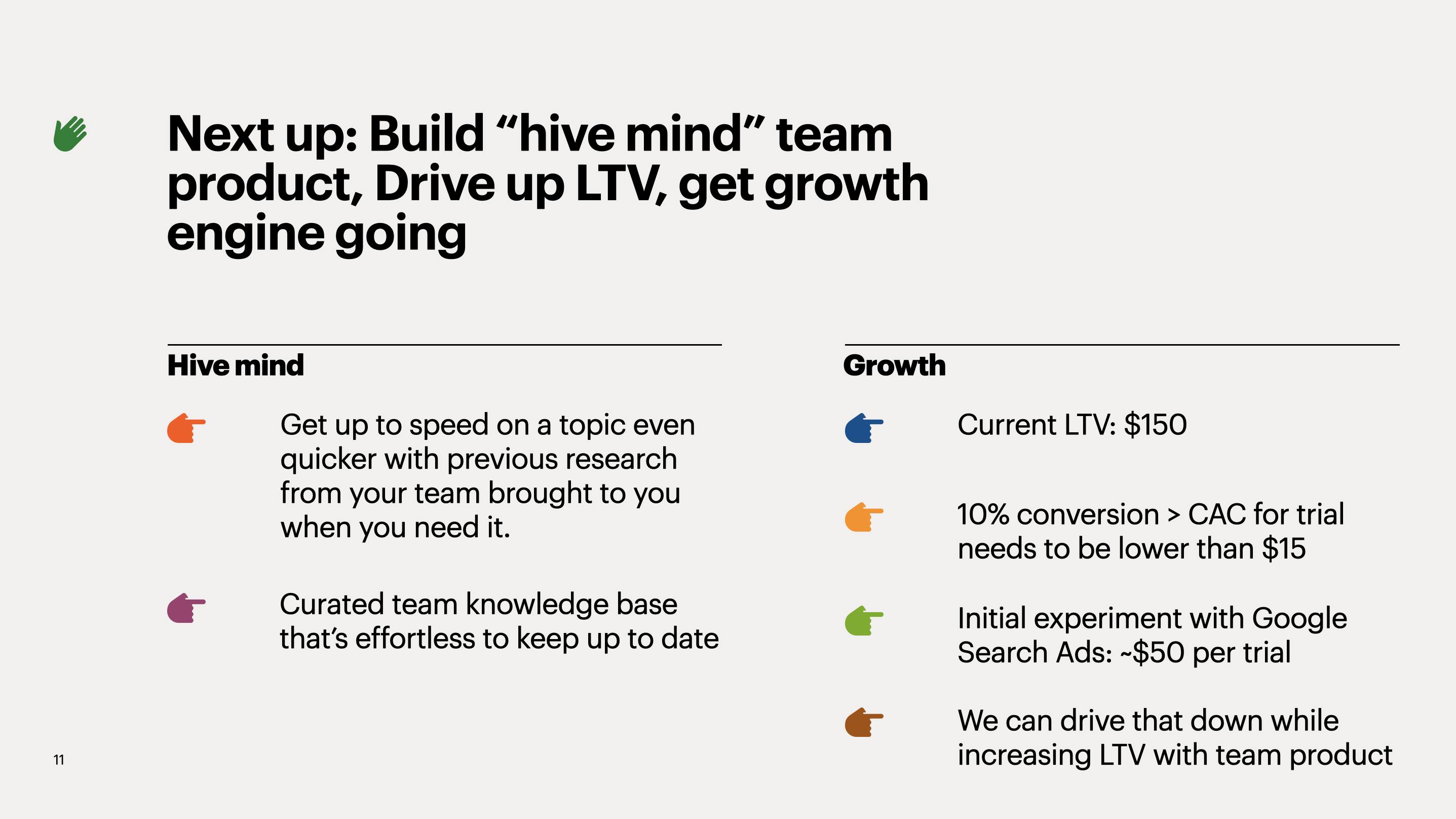
11: The Ask Slide
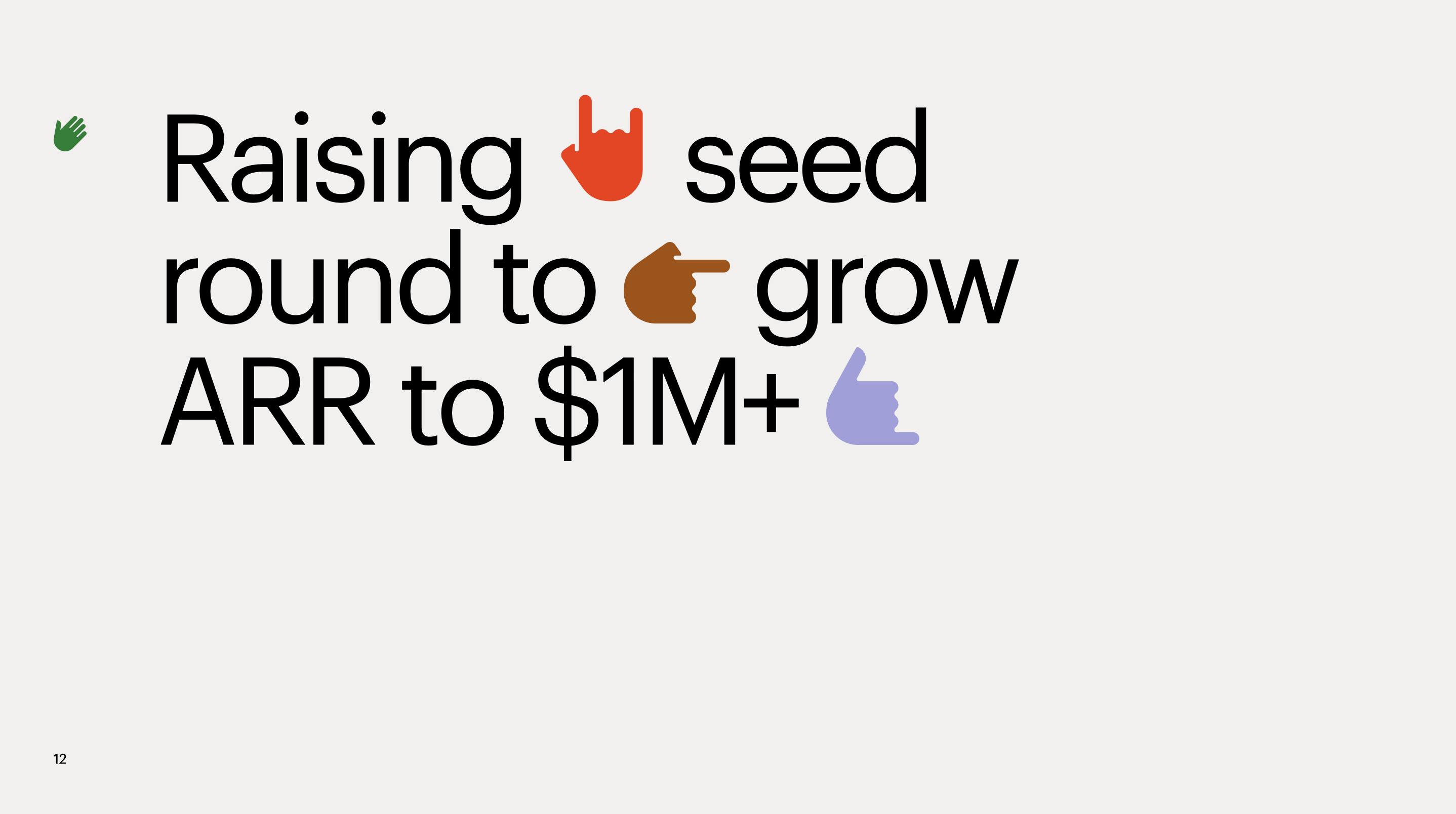
We’re raising money so that we can grow to the point that we’re an attractive Series A target. $1 million in ARR is a standard benchmark for a Series A-ready company.
Appendix
We created an appendix to pre-empt recurring questions - without adding to the length of the core deck.

Appendix: Decreasing Churn
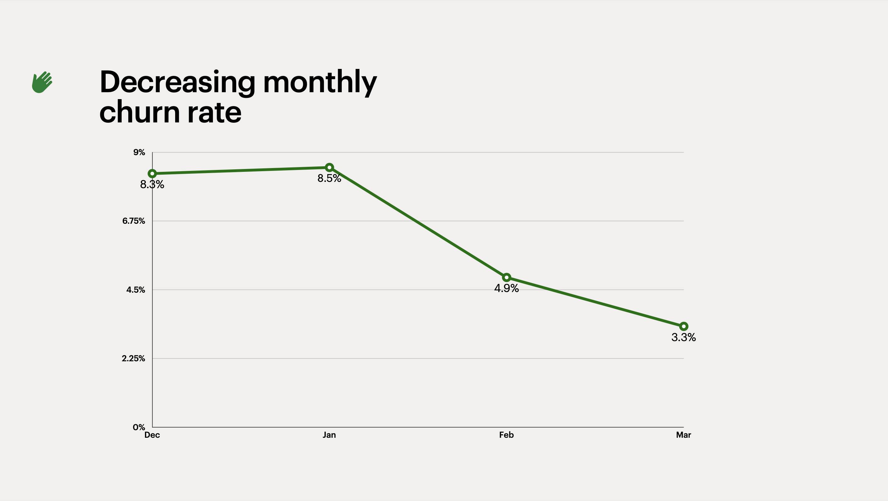
Most seed-stage companies raise money before they achieve product-market fit. We use this slide to demonstrate that we know how to improve our product. We listened to our users’ feedback and make a stickier product:
Appendix: Usage
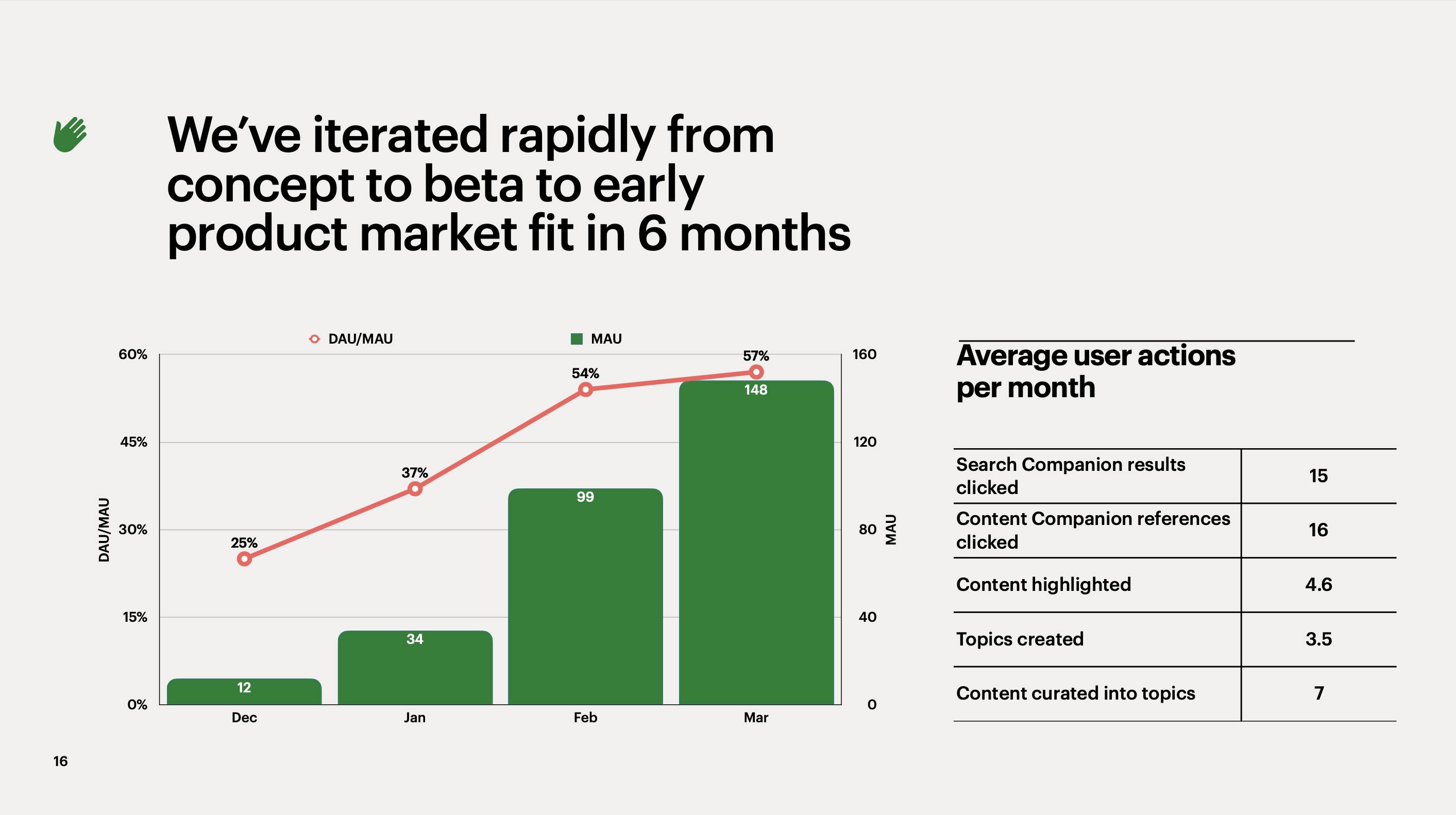
Some investors are interested in seeing more specifically how users interact with your product. This slide breaks out our usage into specific actions.
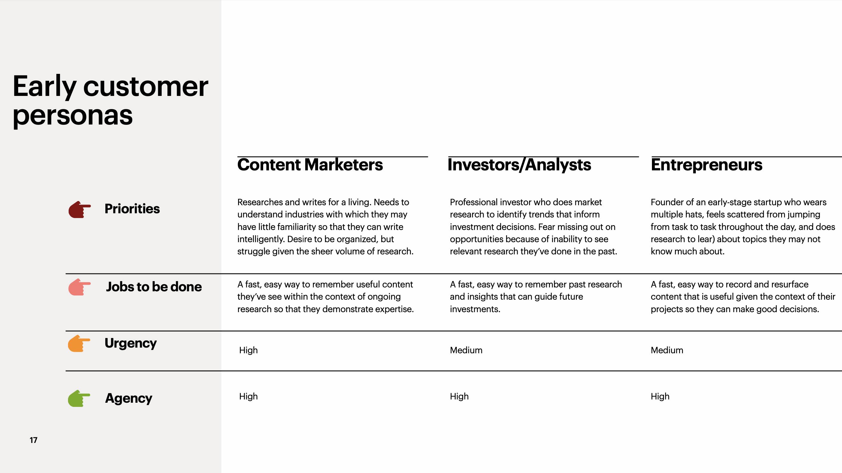
Appendix: Customer Personas
Who needs your product? You’ll hear some variation of this question repeatedly during your seed fundraising process, and you’ll want to have a concise answer (check out slide 14 of Caroline Clark's GTM Nirvana presentation for inspiration).
When an investor asked used, we would skip to this slide and say “folks who do a lot of research love Heyday.”
Opportunity for Improvement
After we shared our pitch deck on twitter, Tony Murphy, the founder of pitch design studio Ask Tony shared suggestions on how we could take our pitch deck to the next level.
Our original pitch deck lacks any mention of market size. Tony’s suggestion is a great example of bottom-up market sizing:
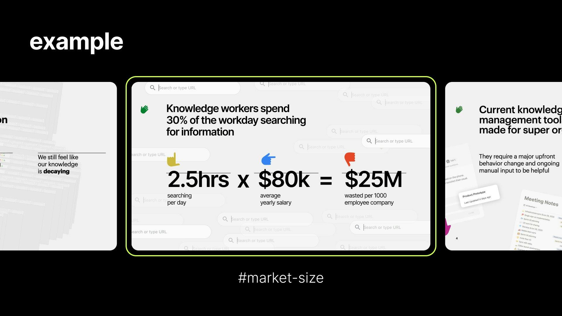
By including a slide like this, we can illustrate the size of our opportunity and quantify the pain experienced by our customers. During our fundraise, we launched on Product Hunt and won #1 Product of the Month. It is worth creating a dedicated slide about this in the appendix, as it would demonstrate further momentum to investors.
Additional Seed Pitch Deck Examples
- How to Design a Better Pitch Deck
- How to Build Your Seed Round Pitch Deck
- Best Seed Pitch Ever
- Dylan Field pitches seed-stage Figma to Daniel Gross
Doing research for an upcoming pitch?
Heyday will save you time and and help you retain more of what you learn.
